Sunday, 23 September 2012

App review: EUssentials

App fever has hit Brussels. Suddenly, every department of the European Commission (the EU's  executive) wants a shiny new app with which to impress its political masters. Predictably, this exuberance is now spilling over to Brussels-based PR agencies. One, Cambre Associates, has produced EUssentials, a free iPhone and Android app that promises to put key information about the EU institutions at the fingertips of those wanting to influence or do business with them. Below, I review the new Android version of EUssentials.

On the face of it, EUssentials appears to address a genuine need. Information about the EU is scattered across the three separate websites of the Council, Parliament and Commission. There is no effective universal search, and only parts are adapted for mobile devices. The single public directory (which does have a mobile version) provides the phone number of every Commission official, but omits their email addresses. So does Cambre Associates' app fill this gap? It does provide offline access to basic information about some of the big fish in the Brussels pond, notably Commissioners and senior MEPs. But it could do it a lot better.

Memory hungry


The app does conform to some important Android standards. It demands a whopping 13.74 Mb of internal memory and does not offer the now standard facility to offload much of this to the SD card. It also takes over the full screen, disabling the Android notification bar.

More important for the target users, it is not clear whether data - much of which is of a time-sensitive nature - will be updated dynamically, or if this requires a new version of the app itself to be installed. Cambre has confirmed that they actively maintain the data presented in EUssentials, and that this is updated dynamically each time the app is launched.

Flags of inconvenience


EUssentials presents information under four main headings - Parliament, Presidencies, Commission and Institutions. These labels could be misleading to Brussels newbies (the Parliament and the Commission are institutions), but we'll let that pass.

In the Presidencies section you can find a list of the Member States that will hold the rotating Presidency of the EU up until the first semester of 2020 (Finland). It's reassuring to see that the Lithuanian Presidency (second half of 2013) already has a website, to which the app provides a link, but slightly alarming that the Greek Presidency that follows in 2014 does not. 

While browsing the future Presidencies, try to memorise each country's flag, because in the Commission section the only clue to each Commissioner's nationality is their national flag. There is no indication at all of their political allegiance. 


Be sure to brush up on your knowledge of the EU flags


This section provides the direct line and personal email address of each Commissioner and - perhaps more valuable - those of each member of their Cabinets. But access to the Commissioners' online presence is poorly and inconsistently implemented. In principle, each  profile includes icons for sending mail to the Commissioner, their Europa web page, Wikipedia entry, Twitter account, RSS news feed and personal blog. But the email icon is redundant, since the email address itself is an active mailto: link, while links to Facebook pages are missing completely. The button for Viviane Reding's RSS feed takes one to an obsolete web page (Europe's Information Society Thematic Portal: Error 404). Commissioner Georgieva's blog is delivered as an RSS feed rather than a web page.

Corridors of power


Perhaps the most useful section is Parliament, where we find not only a calendar of parliamentary sessions (to the end of 2013) but also lists of the MEPs that make up the Parliament's powerful committees. The email address of each committee member is given, as well as their Brussels and Strasbourg phone numbers. (Non-EU citizens, don't even ask.) But knowledge of national flags is once again essential if you want to have a chance of guessing what language each MEP speaks. And surely lobbyists would have appreciated having the scheduled meetings of individual committees added to the calendar?


Pressure points


The essentially geographical view of the EU's Institutions is interesting but eccentric. Buildings are listed in alphabetical order of their institutional acronym (ah, dear old BREY), with no indication whether they are occupied by Commission, Parliament, Council or mere Executive agency. The 'View in Google Maps' option is useful.  But the section as a whole might have been more useful if we could have started the search from a list of EU bodies and departments, rather than a list of buildings.

Personally, I will struggle on with my painstakingly assembled collection of bookmarks, RSS feeds and Twitter lists until that bright new dawn when the EU's Europa portal is refashioned as an information tool fit for a functioning federal democracy. But I am not a lobbyist. This app may thrill the hearts of nervous or obsessive stagiaires. I do wonder, though, whether it will really repay the effort that Cambre Associates has certainly put into building it.

Next post: Android Jellybean's gesture keyboard

Tuesday, 18 September 2012

High time for a new Android phone

. . . but not an HTC One S (at least not in Europe).

It's now over two years since I bought my HTC Desire. It hasn't broken or malfunctioned, and I still use it intensively every day. But as my 'essential' apps swell with every automatic update, the phone's limited internal memory is becoming a real constraint too often. (Google Maps now hogs 19.25Mb and still cannot be moved to the SD card!) Processes slow right down or simply stop, and software cannot be updated until I uninstall another app to free up space. And of course my unrooted phone is stuck on Android 2.2 (Froyo) while the operating system has progressed through Honeycomb and Gingerbread to the gorgeous-looking Jellybean.

So I figured the time had come to pass the perfectly serviceable Desire on to another member of the family and choose myself a new Android device.

I do feel some loyalty to HTC, and I like the solid build of their phones, so my first choice was the HTC One S. The black carbonised metal finish sounded cool, the 4.3-inch screen and slim profile were perfect for me, and I liked what I read about the fast 1.5GHz dual core Snapdragon S4 processor. Possible downsides were the pentile AMOLED display, which some reviewers found 'jaggy', and the lack of an SD Card slot to supplement the 16Gb of internal memory, which is shared between internal memory and data storage. But the pros outweighed the cons, and I shopped around for the best price on an unlocked phone.

I found a great price at Pixmania.be (I live in Belgium). The €424.99 deal came from a third-party vendor, Expansys, and announced the processor as the 1.5GHz dual core Snapdragon S4 that I wanted. But I had read that HTC was having difficulty sourcing the S4, and that in some European markets the One S was being sold with the older 1.7GHz S3 processor, with inferior performance and battery life and some overheating problems. I had no way of checking if these rumours were true, but I decided that the S3 was not for me. So I emailed Pixmania, asking for confirmation that the model advertised really was fitted with the 1.5GHz S4 processor. Yes, I was assured, it was the 1.5GHz S4, as advertised. Okay then! I placed the order.

Two days later, the package arrived, but the model number on the outside of the phone's packaging worried me. I checked with HTC itself, and quickly got a polite reply: "The code Z560e on the box indicates that you have received the 1.7GHz version of the device. This is an enhanced version of the dual-core Snapdragon processor, running at 1.7GHz to provide a comparable user experience to the 1.5GHz S4 chip. There will be no discernible difference between the user experience supported by the two processors, with both delivering a premium experience." But that was not what I had ordered!

Pixmania referred me to Expansys, who did not respond to my message demanding that they refund the full price and cover the cost of returning the device. But with support from the European Consumer Centre Belgium I insisted, and the phone was finally picked up by a courier today. I trust my credit card will be recredited as soon as the phone arrives back at Expansys, and then I'll be looking around for another new Android phone once more.

Does anyone have any advice? The Samsung Galaxy S III looks great, but Samsung's phones always seem a bit flimsy to me. And of course, I'd really like Jellybean pre-installed.

Next post: App review: EUssentials

Sunday, 18 March 2012

Be nice, share - content curation on Android

In today's hyper-connected world, sharing information has become a major preoccupation of our working and non-working lives. Using services like Facebook, Twitter and Google+, we can follow the individuals and organisations that interest us in real time. By combining and commenting on the information and ideas that we gather in the course of our online and offline lives, and publishing a digest of this for our own circles of friends, we attract followers with similar interests who in turn link us to valuable new sources of information. Here, I show how I continue to consume and curate social content on the move with an Android phone.


Cuneiform writing. Photo credit: Nic McPhee
For most of human history, speech was the only means we had to share information with one another. The invention of writing multiplied the possibilities - a letter could cross space and time, a notice could be displayed in a public place for many to read, and any piece of text could be copied for wider distribution. Printing vastly reduced the cost of making copies, but access to this technology was limited to a tiny elite. Then came the photocopier, and not long after the personal computer, the office printer and email. Suddenly, ordinary people were able to share information and ideas with large numbers of correspondents anywhere in the world - instantly and at almost no cost.

If email gave us one-to-many sharing, the web gave us one-to-all sharing. Anyone with a website could now make digital content available to anyone with an internet connection. Today, ad-supported personal cloud computing and social media platforms put the power to publish into the hands of almost everyone, together with sophisticated tools to extend and refine our circles of distribution. (We learned the power of targeting selected or self-selected multipliers who could easily relay information to their own circles.) What's more, these extraordinary capabilities are all available using one hand-held device.

In this post I'll describe the way I use my Android phone to collect, store and publish content to Twitter and other social platforms. Wherever possible, I use cross-platform tools - apps and services that enable me to continue my social media life seamlessly between my desktop PCs and my Android phone.

Content collection
To read my RSS feeds, I use Google Reader on the desktop and NewsRob on my Android phone. NewsRob allows for off-line reading of my feeds, and syncs with Google Reader whenever the phone is connected to the internet, ensuring that the lists of unread items are always the same on the desktop and the phone. Both tools allow me to skim through the titles and snippets of very large numbers of articles. I certainly don’t try to read everything, but I usually clear the backlog once or twice a day, treating immediately or clipping for later treatment everything that catches my eye, and marking the rest as read.

Look, no connection! Reading through my RSS feeds offline with NewsRob.


I also monitor my Twitter stream and lists several times a day and, less frequently, Google+, Reddit and Facebook. Most of the content that I curate comes from these sources, as well as from wider browsing prompted by the articles that I read. (I wrote about web browsing on Android in an earlier post.)

I recently abandoned Tweetdeck for Android in favour of twicca as my preferred mobile Twitter client. Twicca (free on Google Play) has a beautiful interface and a smaller internal memory footprint than Tweetdeck. It also makes extensive use of the Twitter API, enabling you to control all the essential parts of your Twitter account directly from an Android device.
Twicca is a fully-featured Twitter client with a lovely interface and a small footprint in memory.


Whatever I am browsing or reading – a whole article that I may want to share, or just one that contains facts or ideas that I might use later for a tweet or a Google+ post – I clip the page to Read It Later. Read It Later is a simple but powerful cross-platform web clipping manager with a free Android app. Anything can be clipped to Read It Later using the Share menu, and can then be accessed at any time either on the phone itself or on the desktop. Whenever it has a data connection, the Android app downloads all clipped pages for offline reading, whether they were clipped on the phone or the desktop.


I use Read It Later to store web content of all kinds for later reading, online or offline.


Now I've squirreled away a horde of interesting items, I can think about how I am going to publish them.

Publish and be damned
I maintain active accounts on Google+, Facebook and Flickr, but I rarely post to these from my phone. All three platforms offer free Android apps, but these are all rather memory-intensive, and I haven't the space for them on my phone. Meanwhile, although their mobile web interfaces are adequate for consuming content, I find them unusable for creating new posts. So most of my content curation activity from the phone is directed at Twitter.

In the context of breaking news or a Twitter conversation, I want to tweet immediately, of course. Twicca offers automated insertion of @ contacts and recent hashtags, as well as link-shortening. Tweeting directly from the phone can sometimes be awkward  - if you realise that you need to check something before sending, for example. The twiccaDraft plug-in lets me save my tweet temporarily, do my fact-checking, and then retrieve and correct the tweet before sending.

Adding a new Twitter post to Buffer.
But most of my curated content goes out as scheduled tweets, using Buffer. With Buffer's free Android app installed on my phone, Buffer is added to the Share menu (see later).

Buffer stores all the tweets that I send to it and releases them one at a time to Twitter or Facebook, in publication slots that I have defined. Using Buffer's web interface (not the Android app) you can define any publication schedule you like, including separate schedules for each day of the week, in order to maximise exposure to your followers. Whether on the desktop or the phone, you can go into your Buffer queue at any moment to revise or change the order of unsent tweets, or to edit them.

The Android Share menu
Passing web pages, images and other documents between apps using the share menu soon feels so natural to most Android users that it's easy to forget just how important a feature of the Android operating system it is.

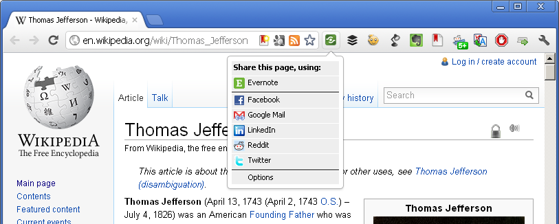
Desktop computing includes no real equivalent of the Android share menu - and nor does the iPhone, as far as I know. On a PC, context menus offer limited options to copy, compress or send a selected file. And browser extensions provide tools for sharing the current web page to various online services (see screenshot).

Browser sharing tools: model for the Android share menu.

But Android's Share menu does something much more powerful than this. From within almost any app, it provides a way to share the selected piece of content (not just a file) not only to online platforms but to a contextually dependent list of services on the web and on the phone itself.

The Android Share menu in native and Andmade versions. A contextual list of web services and apps.


There are many ways to skin a cat. What I've described here is my current curation work flow. But I am always on the look out for improved tools and methods. So don't hesitate to share your own recommendations in the comments.

Next post: High time for a new Android phone

Friday, 9 March 2012

Scarce resources 2 - Battery

Look, I've got very little battery left, so please listen carefully. I need you to

There are few things more frustrating than finding that the powerful Android phone in your hand is suddenly quite useless because it has run out of battery. Batteries are improving, but they are struggling to keep up with the demands of bigger, brighter screens, faster processors, and function-rich apps.

My HTC Desire came with a 1400 mAh Li-Ion battery with a claimed life of 360 hours on standby. I suppose that if you didn't even receive a single call, and if you never turned on the screen, the battery might conceivably hold out for 15 days. But we don't buy smartphones to leave them on standby. We want to use them throughout the day, and not only to make and receive phonecalls, but to send email, read books, listen to music and lead our social media lives. I have learned how to make my battery last all day, and in this post I'll explain how.

You'll find many apps in the Android Market that claim to prolong the life of your phone's battery. But the only sure way to extend battery life is to use less of the functions that consume power. Among the battery-saving apps, the only one that appeals to me at all is Tasker ($/€ 4.49) which automates control of almost anything on your phone in response to signals such as time of day and location. However, I confess that I haven't even tried Tasker.

WiFi and data connections
As I explained in a previous post, I never use the data connection offered by my mobile supplier because I refuse to pay for their data plan. But web browsing and other data transfer is generally held to consume less battery on WiFi than it would on a mobile data connection. If you have a new phone and you don't have a data plan, immediately go from the homescreen menu to Settings > Wireless & networks and make sure that Mobile network is unchecked. (The screenshot below is from the Android 2.2 Froyo settings menu.) If you leave it on, your phone will use the network even if you don't have a data plan, and you'll get a very nasty shock when your next bill arrives.


Turn Mobile network off if you don't have a data plan.
What does eat through the battery is hunting for a WiFi connection, so if you are going to be out of range of a known WiFi connection for any length of time remember to turn WiFi off. I use Free Power Widget (free) to toggle WiFi off and on. In the screenshot below, WiFi is on. I have also installed a very useful little utility app, Wifi Status (free), which flashes up a reminder in the notification bar if WiFi is turned on and the phone is unable to make a WiFi connection.


I use Free Power Widget (top) to toggle WiFi, ringer, screen orientation and screen brightness.

Screen
Your phone's display is an obvious draw on power, and one that can be easily controlled. I set the screen timeout to 2 minutes (in Menu > Settings > Display). I've found this to be the shortest delay that does not quickly become irritating. Some apps, such as my e-book reader, FBReader, for example, allow you to override the timeout while you are using the app.

Screen brightness can be also controlled from the Display settings, and it is possible to turn on automatic adjustment. This increases screen brightness in bright ambient light, and reduces it again in shade or darkness to conserve battery. But I find that the automatic adjustment sets the brightness higher than I need, and I use Free Power Widget to toggle between low brightness, high brightness, and automatic. In the screenshot above, it is on automatic, but I generally leave it set to low. If I find myself squinting to see the screen I know where to tap to change the setting. Some apps, like FBReader and the NewsRob RSS reader, have a Night reading mode, which consumes even less power and reduces the risk of irritating your partner when you read in the middle of the night.

GPS and Bluetooth
Keep GPS and Bluetooth turned off at all times, unless you really need them. Apps that require GPS, like Google Maps and My Tracks, turn the GPS on automatically when you run them.

Charge!
If you follow the advice above, you should normally be able to get through the day on one full charge, provided you don't spend hours watching videos or speaking on the phone. But performance will obviously vary with usage and between devices, and battery life is always a key consideration when choosing a new phone.

A final word of advice - don't forget to put your phone on charge overnight.

Next post: Be nice, share.

Sunday, 4 March 2012

Web browsing on Android

How fast did this page load? Did you notice a delay? Slow page loading is just one of the frustrating aspects of the mobile web experience. Mobile browsing is improving - but slowly, and not for everyone...

The most significant factors determining how fast a page loads when you tap on a link on your Android phone are the site's design, the bandwidth of your current internet connection, the processing power of your phone, and the efficiency of your browser app. A basic understanding of these four issues is helpful if you want to optimise your use of the mobile web.

Mobile site design
Mobile website design is still in its infancy. Even when site owners take the trouble to build special mobile versions, their interfaces are often awkward. In other cases, in an effort to 'simplify' a site for mobile use, the content or functionality that you want has been removed from the mobile version altogether. And many sites have still not got round to adapting themselves for mobile users at all. Despite all of this, mobile browsing is expected to overtake desktop browsing early in 2014. Site owners, take note.

Practically, what difference can this make to your browsing experience? If nothing at all has been done to adapt a website for mobile, it will probably load slowly on your phone. And when it does load it will look very, very small, as the browser attempts to display the full width of a site made for a desktop monitor on your phone's tiny screen (below, left). Complex, multi-column designs make it especially difficult to read a site's content. You can double-tap or pinch to zoom in until the text is large enough to read. But then you may need to scroll left and right to read a block of text (below right). Site navigation can also be difficult. Buttons are often too small for touch control, and nested multi-level menus often don't display correctly.

A website that makes no concession to mobile browsing. Kiss goodbye to extra donations, University of Kent.


And if you want to fill in a complex online form - like the one the University of Kent uses to collect spontaneous donations from the public, for example - then forget it. If you're using a mobile, they obviously don't want your money.

At the other extreme are sites with mobile websites that are completely separate from their main sites. I use the Flickr photo-sharing service and, as you can see below, the mobile site has an entirely different look and feel from the main desktop site, with chunky, finger-sized controls and a single scrollable column of images.

My Flickr photostream - desktop version...
...and, on the left, the mobile version. On the right, the desktop version as it it displays in the Android browser.


The problem with Flickr's mobile website, like many made-for-mobile sites, is that the designers think it's necessary to simplify things (as well as reducing the size of photos and videos, to make loading faster). If the mobile version of Flickr has a way to organise my photos in sets and collections as I can on the desktop, I haven't found it yet.

Most sites that have built a mobile version will detect that you are not using a desktop, and deliver you the mobile site automatically. In the screenshot on the left above, you'll see in the browser's address bar that the URL of the mobile site begins http://m.flickr... This is now a widely used convention for mobile websites. Some sites go further and try to determine your mobile device's operating system, screen size, and browser, and deliver a version specifically optimised for these. Most mobile sites offer a way to override this optimisation and load the main, desktop site. You can often find a link to 'Main website' or 'Desktop version' at the bottom of each page. The screenshot on the right above shows Flickr's main site loaded in my phone's browser. Of course, it's slow, and navigation is awkward (the links are tiny), but at least it's all there.

The browser I use, Dolphin Browser HD - about which I'll say more later - allows you to change the User Agent setting from Android (the default) to Desktop. This fools the sites you visit into delivering their main websites by telling them that you are using a desktop computer. However, as I said at the beginning, mobile browsing is improving. When I started to use an Android phone in early 2010, I found most mobile sites impossibly dumbed-down, and generally set the User Agent to Desktop. Today, many more sites have mobile versions, and the quality of these has greatly improved. For speed and ease of use, I now leave the User Agent set to the default, and load main sites only when I need to.

Bandwidth
One of the early myths about mobile web design was that it should cater, above all, for users on expensive, low-bandwidth connections. Mobile users, it was believed, would never be interested in browsing your content, let alone reading more than short snippets of text. They wanted to get in, grab what they needed, and get out as quick as possible.

There probably are still mobile users like this. But my guess is that the vast majority are more like me. I don't have a mobile data plan and I never turn on a mobile data connection. In part, that's because it's so expensive here in Belgium, where I live. But it's also because I don't really need it. I have 10 Mbps WiFi at home, and 100 Mbps WiFi at work, and there is free WiFi in many bars and restaurants here. If you have a decent ADSL internet connection with a WiFi router in your home, then your WiFi connection there is essentially free, since you are paying for it anyway. So for you, like me, data charges are not an issue. We are happy to browse a site's content at our leisure. And we do read long articles (like this one) on our phones. At least, I do.

As far as I can tell, a decent router on a 10 Mbps internet connection is adequate for normal browsing. Some sites - especially those that are not mobile-optimised - are slow to load. But others load almost immediately. And I haven't noticed any particular improvement in performance when I'm connected to the much faster internet at the office. My guess is that the remaining bottlenecks are elsewhere.

Processing power
What can I tell you? Buy a new phone.

Mobile browsers
Short of spending a large sum of money for a new phone, the best thing you can do to improve your mobile browsing experience is almost certainly to install a decent browser.

The standard Android browser, based on the Open Source WebKit, is actually pretty good. The problem is that, because it is built into the operating system, it is only improved as part of updates to Android itself. Which in my case means never. HTC made a big effort to develop an upgrade to Gingerbread for the Desire, but failed. If I want a newer version of the stock browser, I'll have to get a new phone.

In fact, I have used Dolphin Browser HD since it first appeared in May 2010, soon after I bought my phone. Very full-featured at the time - with pinch to zoom, tabbed browsing, full-screen mode, bookmarks, and a host of add-ons offering specialised functions - this free app has continued to evolve with very regular updates via the Android Market. It now offers an extremely slick, reliable and fast browsing experience.

Some of Dolphin HD's functionality: left, tabbed browsing and the add-on toolbar; right, the New tab speed-dial page


Personally, I don't use either gesture or voice control (introduced in the most recent update), but some will no doubt like them. What is amazing, given the memory limitations of my phone, is that all of Dolphin's rich functionality is packed into an app with a memory footprint of less than 2.5 MB (after moving it to the SD card). HTML5 data cannot currently be cached to the SD card, nor is there a setting to clear the cache on exit from Dolphin, so if like me you are seriously short of memory you'll need to clear the HTML5 cache (from Menu > More > Settings > Data storage settings) regularly. But the app itself is not a memory hog.

One drawback of Dolphin is that there is no simple way to sync bookmarks and open tabs with your desktop browser. Continuous browsing, seamless across different devices, remains an unattainable dream, for the moment at least. I did briefly try the Android version of Firefox, which does offer cross-platform synchronisation. But at the time the app required a huge amount of internal memory, and I found it slow and buggy, with fairly frequent crashes. Now, I am waiting to try Chrome Beta for Android, in order to sync with Chrome on my desktop computers. Unfortunately, it's only available for Android 4.0 (Ice Cream Sandwich) and later. In any case, it will have to be very good indeed to make me give up Dolphin.

Next post: Scarce resources 2 - Battery